
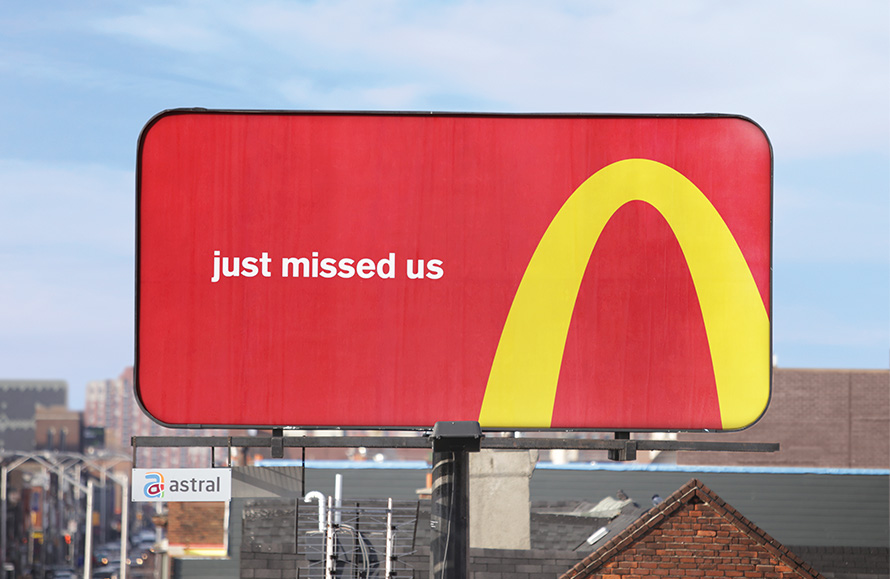
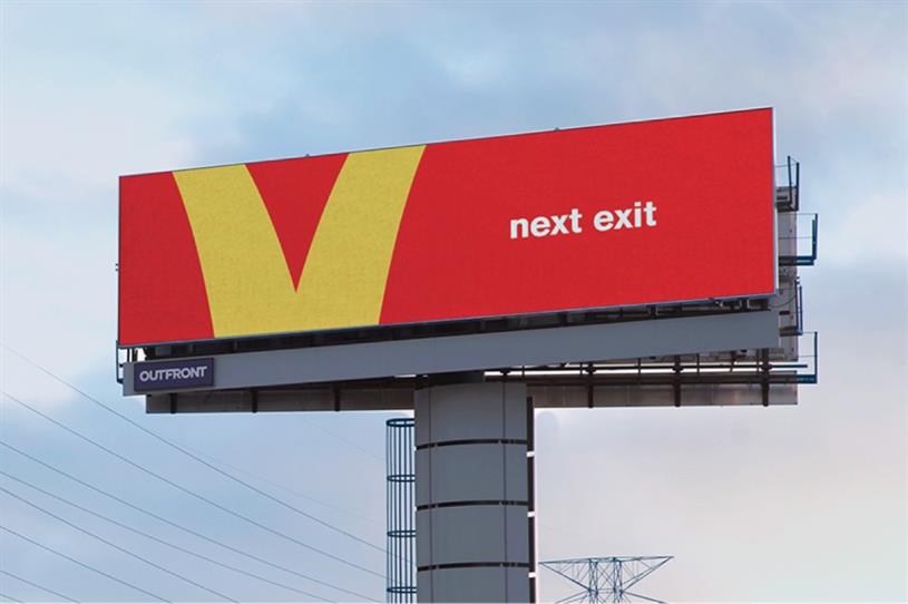
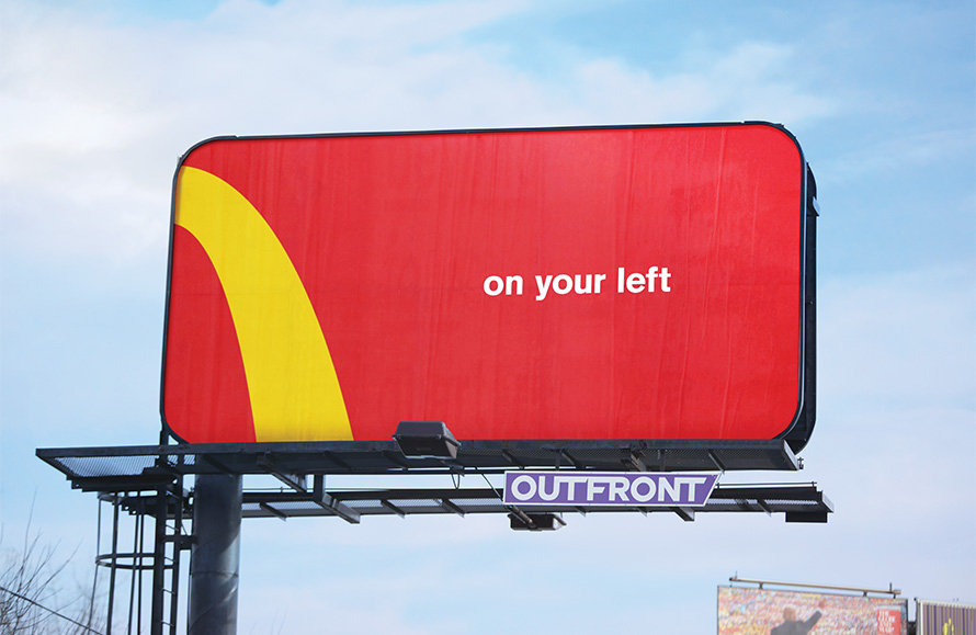
 In 2018 McDonald's came out with its "Follow the Arches" ad campaign. Thi ad was meant to unify all directional billboard ads that McDonald's had around the world, and they did a great job at it. Even though the ad is extremely simplistic and might even look bland, that is exactly what draws the viewer in. With the amount of ad clutter out there it is refreshing to see simplistic ads every now and again and that's exactly what McDonald's did. Their ads used their iconic contrasting and vibrant colors to make the viewer acknowledge the ad as fast food or hopefully more specific, McDonald's. What really sells the ad for most viers is McDonald's use of their logo (the golden arches), this helps the viewer make them a complete connection to McDonald's. In the ad McDonald's uses part of their golden arches as a directional image; with 4 different ads in the campaign the options are, on the right, on the left, take a u-turn(just missed us), and the next exit. Not only are these instructions for the hungry viewer who has been on the road for hours but it also leaves an impact on them that will stay with them even after their road trip. Because the ad is so witty it is much more likely for the viewer to remember it because of its simplicity and creativity. This connection that McDonald's made with the viewer did help them make initial sales off the ad but it also leaves the viewer with an experience that they won't soon forget. And now, wether it is conscious or unconscious, when on the road and looking for a quick place to eat it is more likely that a viewer of the ad will choose McDonald's because of the ad's prominence and ability to stick out through simplicity.
Comments
Post a Comment